Interview: How Overhauling MyTherapy’s Symptom Tracker Adds Value for Patients & Partners Alike
Symptom tracking is a vital component in understanding how well a treatment is working. Users of MyTherapy and our partner programs will soon benefit from an entirely new symptom tracker, built with the real-world needs of patients in mind
MyTherapy has always been built and designed to meet the day-to-day needs of people living with chronic diseases. MyTherapy’s symptom tracker is used by only a small percentage of users and feedback from them tells us that it is a feature that can be improved. With that in mind, we recently set about overhauling the symptom tracker; starting with a blank canvas, we aimed to understand the daily needs of users and how we can offer valuable support to millions of people worldwide.
In this interview, product owner, Itzel Hervert, and UX designer, Sasha Shumarayeva, tell us how they have gone about overhauling the symptom tracker. Read how the changes will benefit users and how our approach of building on MyTherapy means our pharma partners can provide improved digital patient support.
Itzel, what is the benefit of having a symptom tracking feature in MyTherapy and our partner programs?
Itzel: The symptom tracker is a bit of a hidden gem. It can bring a lot of value to users but very few people use it at the moment, which is one of the reasons we are overhauling it. In terms of benefits, it is one of the clearest ways for users to tell if their treatment is working; if you’re having migraines and your doctor prescribes you medication and says: “our goal that you stop having migraines every day but rather twice a week, then once a week, then once a month,” then you need to be able to track whether that happens. As well as the frequency of symptoms, it’s also important to track severity.
Tracking this information helps users understand their progress and is also very helpful for doctors to know whether the treatment is the most suitable option.
You say it’s a hidden gem, how widely used is the tracker?
Sasha: Around 0.8% of users have reminders set up to use the symptom tracker and roughly 3% use it spontaneously. That backs up what Itzel said about it being a hidden gem because we are sure that more people could benefit from using it. Although we refer to it as a ‘symptom’ tracker, it can also be used to track the side effects of a users’ treatment, which can be as important when deciding if a treatment is the best option.

How do you hope overhauling the feature will help increase usage?
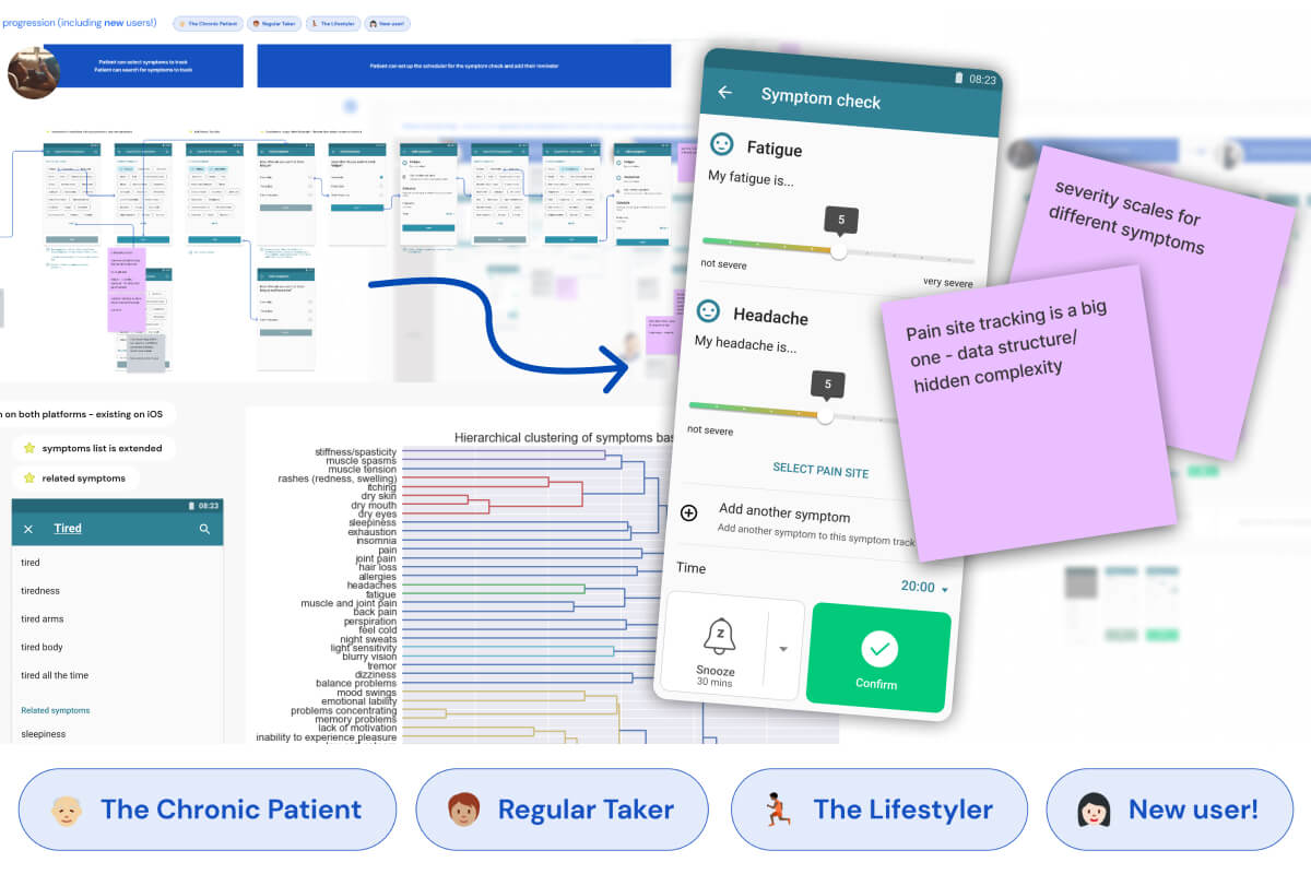
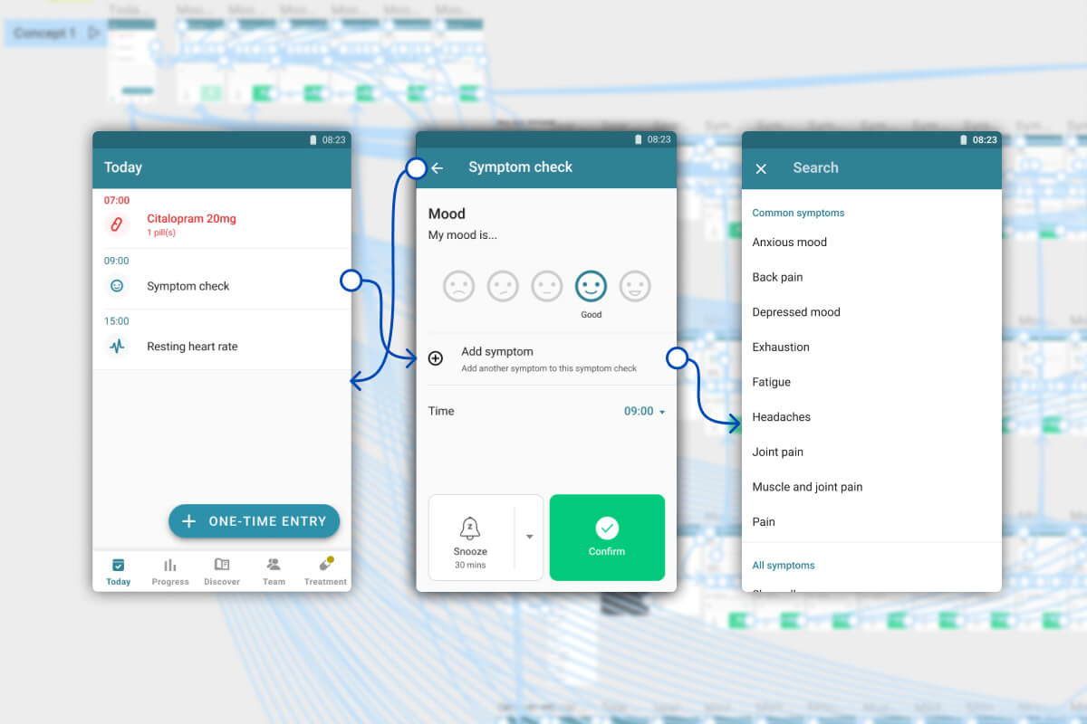
I: We have to understand the reasons why the symptom tracker is not widely used. At the moment, the feature is more of an overall ‘wellbeing’ tracker so encompasses your mood as well as symptoms. The design is not well-suited for tracking individual symptoms.
The feedback we have received tells us that it would be more beneficial for users to see a separate tracking event for each symptom and have information and charts for them individually. The aim is not to increase usage, it’s to make the symptom tracker a more valuable feature for more people. If we manage that, usage will increase.
Additionally, this is something our partners are supporting. The improvements to MyTherapy apply to all the programs we build for partners on top of it and we know it is something they are keen on.
Overhauling the entire feature seems like a big task. Where do you begin?
I: We decided this was an occasion where we could start with no limitations. We thought: ‘if we had all the money and time in the world, how would we do it?’ We started with really ambitious ideas and then started breaking them down and deciding what would be included. We set the bar high.
With all these ambitious ideas, how do you decide which ones to go ahead with?
I: It comes down to the real world and thinking: ‘okay, we don’t actually have all the time and money in the world,’ so we started cherry-picking and prioritizing the ideas that would bring the most value to the user.
We can then define one single goal per section of the project. So, the first goal is to create the scale so that users can track the severity of their symptoms over time, then the next goal is to be able to showcase that in the Progress section of the app, which really closes the circle for patients. Then comes adding the information to the PDF health reports users can download and print, which helps close the circle with their caregivers and HCPs.
As soon as the patient can complete the usage circle we consider our first delivery complete, then we start working on the ‘luxurious’ features that will make it even better
I know that the list of symptoms you’ve come up with is pretty long in order to cover as many use cases as possible. Why can users not simply input their own symptoms instead of choosing from a defined list?
I: On the one hand there is UI and UX design, which Sasha will discuss later, and on the other, there is the legal side of things. We are legally obliged to report adverse events to our partners, so when a MyTherapy user taking medication from one of our partners reports an adverse event we need to be clear about what it is.
If someone enters something like “googly eyes” there’s no way for us to know if that is an adverse event because it’s not a term that has been approved by a medical professional. So, we’re making sure the list of symptoms is approved by our team of pharmacists.
From a usability perspective, there is also the fact that symptoms differ from one another. If I’m tracking pain, I can tell you my pain is 7 out of 10 but if I’m tracking insomnia that scale doesn’t fit. Rather, I can tell you how many nights per week or per month I haven’t been able to sleep.

S: To add to this, we are also working closely with our data science team to know which symptoms are used most commonly and this will be important for future developments. If, for example, pain is used by a lot of people we can think about adding pain site tracking, where you can pinpoint on your body where the pain is. Such symptom-specific features wouldn’t be possible with user-defined inputs.
So, will the interface and scale differ from symptom to symptom?
I: Not yet, but it might be something we add. For now, we have symptoms on our list that can abide by this zero to 10 scale. But we are already considering the ones that need separating; for example, at the moment in the app mood is measured with smileys, which might be something we want to keep. We are working with our team of pharmacists and consultants to understand what fits our scale and which ones need special handling.
Finally, what benefits do you see this overhaul having for our users and partners?
I: Well, if our patients are happy, our partners are happy. If we are able to shed light on how the treatment is going, that is beneficial for everyone.
S: A key point is that, for partners, the majority of users are living with chronic diseases. This makes it especially important that we are able to generate these user insights and help people better understand their treatment. We see that users on our partner programs use features like the Progress screen and the PDF health reports more often than the general userbase, so we believe it is this group of users who will benefit most from the new symptom tracker. But the important thing is that because MyTherapy is the platform for our partner programs, the improvements we make to MyTherapy are available to our entire userbase.
This makes the time and effort spent on projects like this one are worthwhile, as they bring a lot of value to a lot of people.
In part two of our interview, Sasha and Itzel explain the process of ensuring the symptom tracker is designed to provide the best possible user experience.
Are you interested in building your digital patient support on MyTherapy and benefiting from every update we make to the app? Then don’t hesitate to get in touch.


