Interview: Designing & Developing MyTherapy’s New Symptom Tracker to Deliver the Best User Experience (UX)
Designing and developing a symptom tracker to meet the diverse needs of MyTherapy’s userbase of millions is no mean feat. Read how prototyping, usability testing, and living by the “UX is a team sport” adage were key to overhauling the feature
In part one of our interview with product owner, Itzel Hervert, and UX designer, Sasha Shumarayeva, they told us why we are overhauling MyTherapy’s symptom tracking feature. In part two, read about the task of designing and developing the new symptom tracker from the ground up, and how aspects such as prototyping and usability testing are used to provide the best user experience (UX) to the millions of MyTherapy users around the world.
In the first part of the interview, we talked about why we are overhauling MyTherapy’s symptom tracker. Where do you start when it comes to designing and building the feature?
Sasha: The first step is really listening to user feedback. We have millions of users, so we get a lot of reviews and requests through our user support team. The main thing we found is that most people want a severity scale for their symptoms, so that was a good starting point. We then get everyone together – developers, testers, product owners, every stakeholder – and audited our current solution. We tried to think of it from end to end, consider all the touchpoints, and think about real-life scenarios.
That includes everything from spontaneously recording a headache to tracking symptoms over months, which is particularly important for our partners, as their programs are typically for people living with chronic diseases. From there, we can start to form ideas about how the feature can fit all the requirements.
Given the size and diversity of MyTherapy’s userbase, I imagine there is a range of different requests. How do you figure out which solution will bring the most value to the most users?
S: It comes from gathering a lot of quantitative and qualitative insights. With MyTherapy we are lucky that we have millions of users, so we can leverage that and find very strong patterns and themes in the data. We work closely with the data science team and ask them very specific questions about how this feature affects users and how they interact with it.
We also have thousands of reviews, so we work with our user support team and use techniques like sentiment analyses to synthesize all of the input we have received from users over the years and identify strong patterns and themes.
The data and reviews we have help us determine users’ needs and these influence the UX decisions we make.

Itzel previously explained the reasons for having a defined list of symptoms, how do you go about finding the best input method from a UX perspective?
S: After we’ve gathered all of our insights the second phase is to start designing different concepts. One of the biggest focuses was how do you search for and select a symptom, what would be the easiest and shortest path? It’s not straightforward as it’s a long list and you need to allow for things like synonyms.
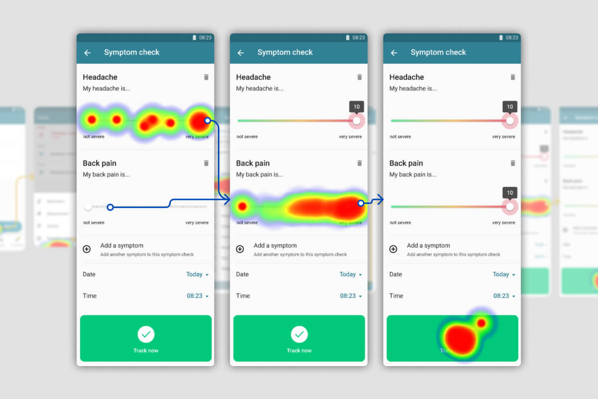
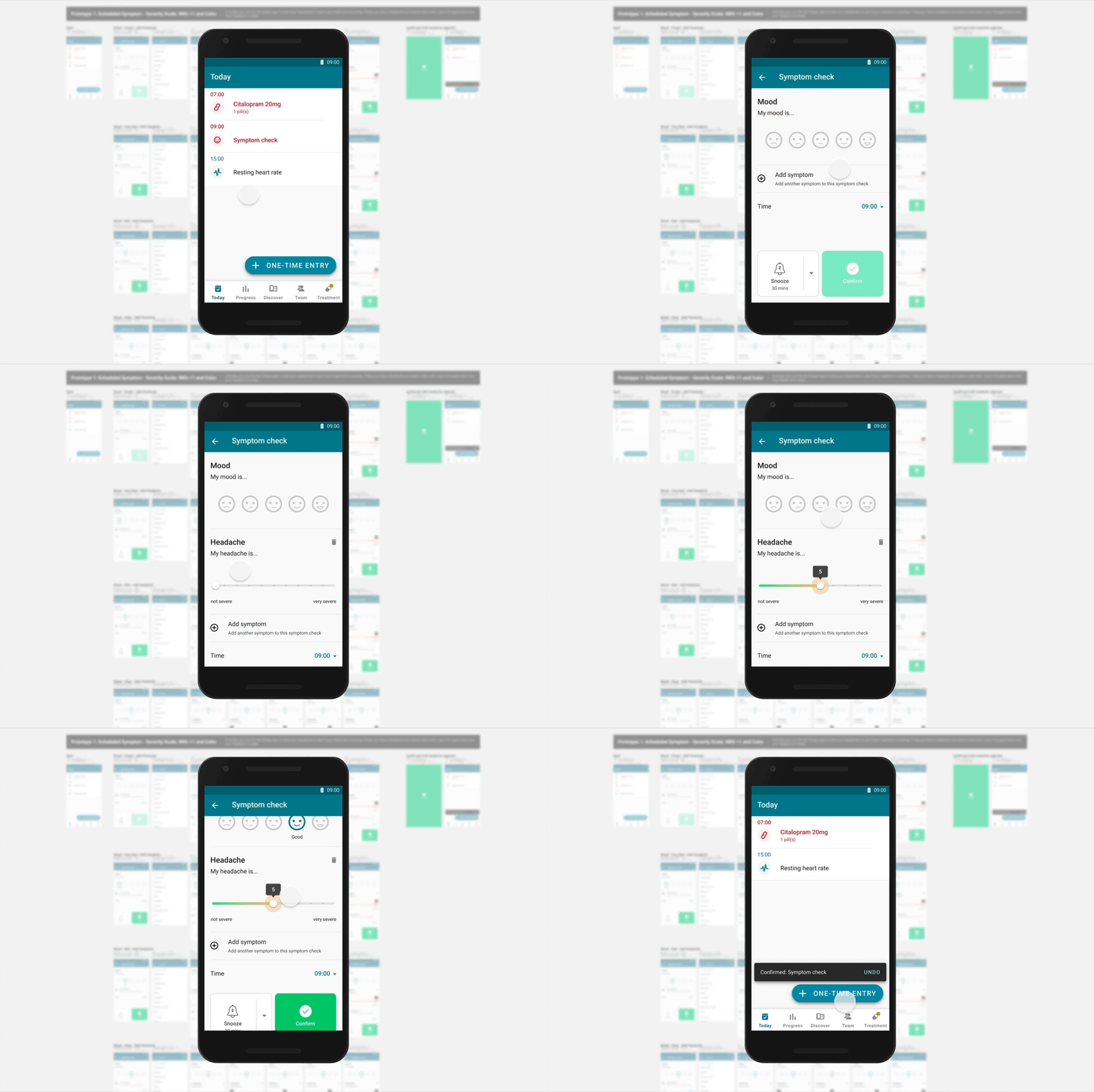
We designed five or six concepts and did really early prototype usability testing. High-fidelity prototypes are designed to be as close as possible to what we would implement with the app and allow us to get this really important feedback early on. So, we run these tests with an unbiased group of testers that would be representative of MyTherapy’s userbase.
By having different prototypes, we can test different methods of selecting symptoms and test other aspects, such as the severity scale.
How do these tests work?
S: There are many different ways and different tools to crowd test. These services allow you to access an unbiased group of global participants of different ages and different demographics.
What we’re looking for in these usability tests is a high success rate and any issues we can spot along the way. We can use tools like heat maps to see where users are interacting with our prototypes and where drop-offs occur and see how long it takes to complete a certain task. We also ask what was frustrating or what did they struggle with, or what was strange about the design.
We have high standards, so we’re looking for a very high success rate.

From there, what steps are there for releasing the feature?
S: When we’re happy with everything that’s been tested we can refine it before implementing it. After that, we continue to review the metrics and feedback to see where we can iterate and improve.
Itzel: We also do phase releases, as we did when we recently launched the new ‘Today’ screen in MyTherapy. So, we start rolling it out very slowly because we’re not only monitoring how happy users are, but we’re also monitoring how stable the development on the feature is.
If it starts crashing, it can be the most beautiful feature in the world but it’s useless!
It’s important to get real users using the feature, though, so we might start rolling it out to just 1% of users. Then if we see that it’s okay and there are no crashes, we can maybe increase it to 5% or 10% and continue until we reach 100%. It’s a bit of a safety net because if something is not working, it’s far easier to roll back from 5% than 100% of users.
What we’re some of the main takeaways from this project?
S: I think it is interesting that coding is the last thing our developers did. We were living by the “UX is a team sport” model and with this project, we did see a lot of passion come from our developers. We all did desk research and did the usability testing together, everyone was included throughout the process. It is great to see because when you have your development team invested in the process, then everyone can take ownership of it, and you end up having a more meaningful outcome.
Do you want to provide digital patient support that is designed and developed to provide the best user experience?
By building your digital patient support program on MyTherapy, your patients can benefit from every improvement we make to the app, along with modules tailored to your product. Our experience and expertise in areas such as UX design allow us to build effective programs that engage patients. Sounds interesting? get in touch.


